
Framers’ Intended Congressional Districts
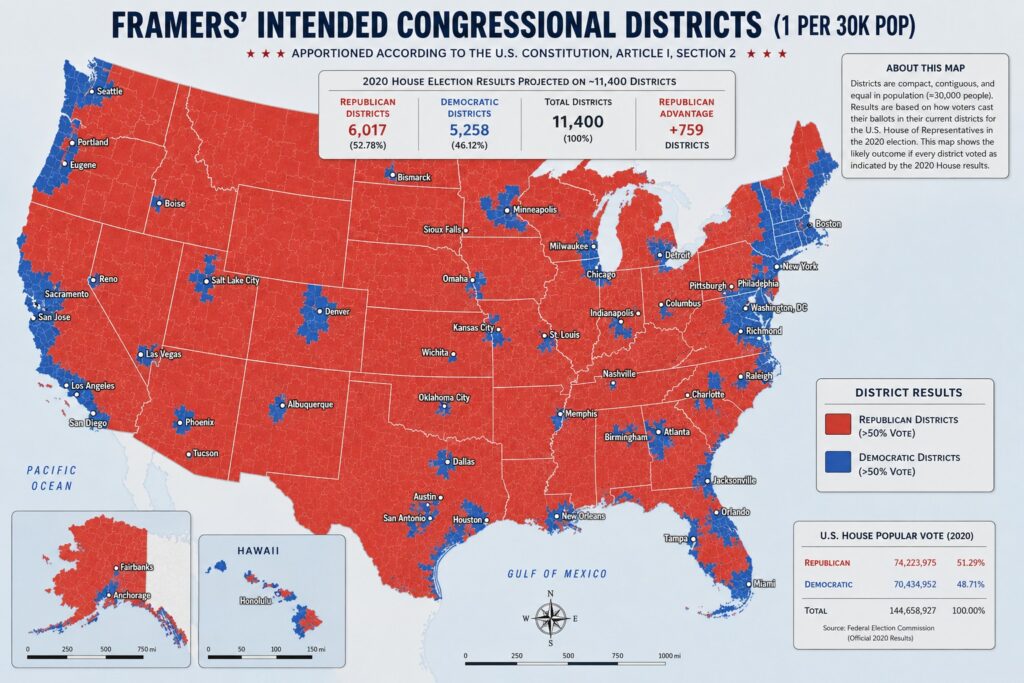
A striking visualization titled “Framers’ Intended Congressional Districts (1 per 30K Pop)” reimagines the United States House of Representatives as the Founding generation might have envisioned it: with far smaller, more granular districts of roughly 30,000 people each—compact, contiguous, and equal in population.
Using 2020 House election results projected onto this system of approximately 11,400 districts, the map paints a dramatically different picture of American political geography than today’s 435-district House.
The Numbers Behind the Map
According to the graphic’s data (sourced from official 2020 Federal Election Commission results):
- Total districts: 11,400
- Republican-won districts: 6,017 (52.78%)
- Democratic-won districts: 5,258 (46.12%)
- Republican advantage: +759 districts
This outcome closely tracks the national popular vote for the House in 2020, where Republicans received 51.29% (74,223,975 votes) and Democrats received 48.71% (70,434,952 votes) out of roughly 144.7 million total votes cast.
The near-proportional translation from popular vote share to seat share in this hypothetical is notable given the fine-grained districting.
Visual Geography of the Hypothetical
The map shows vast expanses of red across the South, Midwest, Mountain West, and much of the rural and suburban heartland. Democratic strength is concentrated in:
- Major coastal metropolitan corridors (Northeast, Pacific Coast)
- Urban cores in the Midwest and South (Chicago, Detroit, Atlanta, etc.)
- College towns and some scattered Western pockets
Even within deep-blue states like California and New York, the map reveals substantial red territory in inland and rural areas. Conversely, traditionally red states contain blue islands around major cities.
Because districts are designed to be compact and roughly equal in population (~30,000 people), this visualization largely eliminates the effects of large-scale gerrymandering and the winner-take-all dynamics of oversized current districts.
Constitutional Context
Article I, Section 2 of the United States Constitution originally called for apportionment such that “the Number of Representatives shall not exceed one for every thirty Thousand” inhabitants.
The current 435-seat cap (fixed since 1911, with temporary adjustments) has resulted in districts that now average over 760,000 people—more than 25 times larger than the framers’ benchmark.
This graphic attempts to model what a return to that constitutional ratio might look like, projecting 2020 voting patterns onto much smaller units.
Statistical and Political Implications
Proportionality:
In this model, the Republican seat share (52.78%) is only modestly higher than their popular vote share (51.29%), suggesting that with very small districts, national outcomes would more closely mirror the popular vote—though local clustering of like-minded voters still produces a geographic advantage for Republicans due to their broader distribution across more land area and smaller population centers.
Urban-Rural Divide:
The map underscores the well-documented urban-rural political polarization. Dense blue clusters appear in cities, while surrounding suburbs and exurbs often tip red. With ~30k population districts, many more suburban and small-city areas would have their own representatives.
Reduced Gerrymandering Impact:
Extremely granular districts are harder to gerrymander effectively over large scales. The visualization therefore approximates a more “neutral” geographic reflection of voter preferences, absent creative district line-drawing.
Scale Matters:
An 11,400-member House would be unwieldy by modern standards—but we have the technology to handle it and it would eliminate many of the problems with what happens in today’s House.
Limitations of the Projection
The map is a thought experiment. It applies 2020 voting data retroactively to hypothetical micro-districts without accounting for how voter behavior, turnout, candidate quality, or campaign dynamics might shift under such a radically different system.
It also assumes perfect compactness and contiguity without addressing practical challenges like county/municipal boundaries or minority representation requirements under the Voting Rights Act of 1965.
Nevertheless, the graphic serves as a provocative reminder of how changes in district size and apportionment fundamentally alter representational outcomes.
In an era of debates over electoral reform, expanding the House, or combating gerrymandering, this “framers’ vision” map illustrates one possible path toward finer-grained democracy—and the persistent geographic realities that would still shape it.
The final takeaway is clear: even in a maximally decentralized, small-district system aligned with original constitutional ratios, the 2020 electorate would have delivered a solid but not overwhelming Republican majority in the House.